FADDY AL-HASAN

Policy & Cover Check
Simplifying healthcare cover information for over 1M+ members
The Challenge
Health insurance is inherently complex.
Vhi members often struggled to understand exactly what they were covered for, particularly when checking benefits for hospitals, outpatient treatments and healthcare services. Insurance terminology, policy structures and medical jargon created uncertainty, resulting in avoidable customer support calls and frustration.
The existing experience provided access to coverage information, but understanding it required significant effort from users.
The challenge was simple:
How might we help members confidently understand their healthcare cover without needing to contact customer support?
Understanding the Problem
Research revealed that the issue wasn't a lack of information—it was how the information was presented.
Users often found themselves overwhelmed by:
-
Complex healthcare terminology
-
Dense content structures
-
Inconsistent naming conventions
-
Difficulty finding relevant facilities and services
-
Low confidence in understanding what was covered
Many users abandoned the journey altogether and contacted Vhi directly for clarification.
This created friction for members while increasing pressure on customer support teams.

The Approach
Rather than redesigning the entire service, we focused on making complex information easier to understand.
Working closely with customers, stakeholders and subject matter experts, we used research and usability testing to identify where confusion occurred and how information could be structured more effectively.
Key activities included:
-
User interviews
-
Journey mapping
-
Content audits
-
Information architecture reviews
-
Prototype testing
-
Iterative usability testing
The goal was to reduce cognitive load and increase confidence throughout the experience.
The Solution
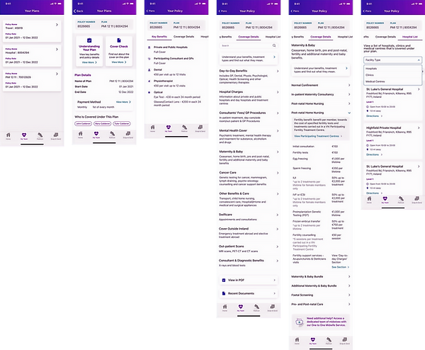
We redesigned the Policy & Cover Check experience around clarity and comprehension.
Simplified Content Structure
We reworked the information hierarchy to surface the most important information first, helping members quickly understand their eligibility and benefits.
Reduced Insurance Jargon
Complex healthcare and policy terminology was translated into simpler, more accessible language, reducing the effort required to interpret coverage details.
Improved Facility Discovery
Users could more easily identify which hospitals, clinics and outpatient facilities were covered under their plan, reducing uncertainty during healthcare decisions.
Mobile-First Experience
The journey was optimised for mobile devices, allowing members to quickly check cover information whenever they needed it.
The result was an experience that felt more like a helpful guide and less like reading an insurance policy.


The Outcome
The redesigned experience delivered measurable improvements for both members and the business.
Results
-
12% reduction in coverage-related customer support calls within the first three months
-
26.5% adoption and completion rate of the Cover Check journey
-
Improved customer confidence when checking healthcare cover
-
Reduced reliance on support teams for routine policy queries

Reflection
One of the biggest lessons from this project was that information design can often have more impact than adding new functionality.
By focusing on content hierarchy, language and user understanding, we transformed a complex insurance journey into a self-service experience that reduced support demand while helping members make informed healthcare decisions.
Sometimes the most valuable design work isn't creating something new, it's making something complicated feel simple.